The following chart is a screen shot of our Volatility Meter. The tool gives you the ability to toggle across different time frames and see how different asset mixes performed.
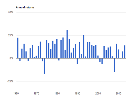
The chart below shows the annual returns (1961 – 2013) for an indexed portfolio made up of 40% fixed income and 60% stocks (half Canadian and half foreign).
After a long period of rising markets, it's not a bad time to plug your Strategic Asset Mix (SAM) into the meter and play with it.
The chart is a great reminder that good long-term returns come with up and down markets, and we shouldn't be surprised when either comes along. Keep in mind, however, that the bars are annual returns (including dividends), which means in some cases they mask dramatic, short-term market moves that either happened within the year or bordered two calendar years. For example, the Canadian stock market was down 20% between April and November in 2011. In 2008, the bar (-33%) understates the drop from June, 2008 to March, 2009, which was almost 50%. In other words, the live concert is more impactful than the Youtube video.
When you're looking at your mix, ask yourself - Would any of the down bars force me to change my strategy? Be realistic. Think about how you felt during the tech wreck or the 2008 crisis. If the answer is yes, then you should go back to square one and revisit your SAM. And if it's helpful, we'd be happy to talk.
We're not a bank.
Which means we don't have to communicate like one (phew!). Sign up for our blog to get the straight goods on investing.

Steadyhand helps Canadians grow their wealth with a simpler, more human experience. Learn more here.